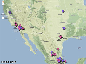
Pittsburgh-based biochemist created a map on April 21 to track the spread of swine flu. He created the map using the free Google maps service. By April 30 it was viewed 290,000 times and had over 3,000 comments. To create the map Niman used media articles from around the world and for foreign language articles he used Google's translation site.The map has geographic markers with different colors and characteristics like a dot or no dot in the center that show where swine-flu cases have been reported by the international and local media. The markers with dots indicate that the swine flu case was non-fatal. A yellow marker indicates that the case turned out to be negative, a pink one indicates a suspected case and a purple one indicates that the case is reportedly confirmed or probable. By clicking on the markers you can view more details in a box, such as number of deaths.
Information from: http://edition.cnn.com/2009/TECH/04/30/online.flumaps/index.html
No comments:
Post a Comment